Thursday 31 January 2013

Poster inspiration


All of these posters have female antagonists which is the same as our teaser trailer so have drawn on these films in particular as a source of inspiration. Each of these posters have the antagonist clearly shown face on to the viewer, this tells me that character must be established in teaser posters especially. The positive aspects I notice from these posters I will consider when designing the poster for our teaser trailer 'Bitter Sweet'.

Orphan
  • Close up of the antagonist 'Esther' directly face on looking straight at the viewer - draws your attention to her even though it is uncomfortable for viewer as she appears to be staring at you
  • Her eyes have been edited darker so that from a distance they appear to be all black creating a demonic look, the highlights on the face have also been heightened to make her brighter, more noticeable and shadows more defined
  • Edges of the poster have been blurred slightly to draw focus subtly inwards to the clear, illuminated face 
  • Poster is very symmetrical and everything is centred, almost in a line starting from her hair parting straight down
  • Colour - blue is a calm colour which dominants the poster but contradicts the genre of the film however it is contrasted with the deep red neck choker which is a common colour for horror
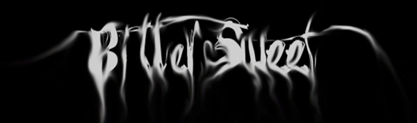
  • Typography 'Orphan' is of mixed letter cases and looks scribbled like a child's writing which reflects themes of the film
  • Has a tagline in smaller case to the the title of the film
  • Taglines create enigma as to who this character is, children usually are innocent but we are told that 'there's something wrong with Esther'
  • Has production company names small at the bottom of the poster   
Carrie
  • Again a close up image of the antagonist 'Carrie' although she appears to be looking down slightly into the camera
  • Direct eye contact with the viewer which creates an uncomfortable feeling 
  • The tears and blood on her face mirror one another but poster is not completely symmetrical 
  • Her hair frames the poster also 
  • Bold, noticeable image of a cross on her necklace which gives the audience a clue towards the character 
  • Editing has created more drastic shadows and highlights in the image
  • Colour is quite dull and greyish on her face but the blood creates the horror aspect and recognises the genre 
  • Poster is once again centralised with the titles centred 
  • Tagline is small above the title
  • Typography shows a crack running through it which hints to the character once more
  • Coming soon is included
Jennifer's Body
  • Antagonist's face in this poster is only partially shown which creates enigma as to who they actually are
  • Viewer is directly drawn to the bold image of the red lips - connotations of image being seductive, alluring and sexual 
  • The blood dripping from the antagonists mouth however suggests the horror genre 
  • Image has been edited to look almost cartoon like rather than realism 
  • Dark hair and bright lips contrasts to the pale white skin - reminder of snow white look perhaps
  • Typography looks like a high school varsity font giving hints to the films plot and setting
  • Titles use previously popular, successful film 'Juno' to interest viewers as it from the creators 
  • 'Megan Fox' is also used to draw in possible viewers
  • The title also 'Jennifer's body' is possibly suggestive alongside the seductive image which would show this is a sexualised horror film 
The Loved Ones
  • This poster depicts the antagonist although she is at a different angle compared to the other posters looking more down the camera lens following the line of the drill she is holding
  • The editing of the poster has blurred more of the background so that viewers focus mainly on the drill and antagonists face before looking more at the background showing disco ball and lights
  • Antagonist seems sweet and princess like because of what she is wearing but the drill pointing directly at the viewer makes her look torturous 
  • We are looking up at her so she is in a powerful position which hints towards her character
  • Typography subverts horror convention but instead is pink and girly 
  • Tagline 'Prom can be torture' provides a clue to the plot
  • Uses 'coming soon' 
After looking at these poster examples I can take from them that for a teaser poster it is important to establish character. I found that these posters were effective as they simply used the antagonists face. The posters are unsettling and uncomfortable, reflecting the genre, for the viewer by having them looking directly into the camera. This is something we would apply to our poster by including our antagonist and hints towards the plot and character. Taglines are also important to suggesting plot and typography is creatively done to convert or subvert genre. 

Amy Freeman

Casting a Family

To use our family concept we will have to cast 5 actors: main protagonist, Mum, Dad, Brother and Sister.


Role: Sister
Name: Polly
Age: 8
Availability: Libby's sister so would be easier to contact and no issues about child care.
Appropriateness: Has acting experience in short films. Cute, round freckled faced innocent looking child.

Role: Brother
Name: Reece
Age: 10
Availability: Daisy's brother
Appropriateness: 


Overall we feel that it is difficult to cast and make over a young actor to look like a parent. This would greatly impact the effectiveness of our teaser trailer and  may be difficult for the audience to understand the role of the characters. Also, there may be issues with children acting (especially if they have no experience) and wearing make up etc.


Website Creation

Once we'd layed out and designing our website, we began the implementation using Wix.com, a user-friendly online platform to create websites using 'drag and drop' tools. As I had previously used this website I took the lead in creating with Amy C as design consultant.

As one of our criteria was to be user-friendly and to fill no more than one page, we knew the simpler the website, the better. We agreed to start with a completely blank document in order to make sure we stuck to this and did not over-complicate it.

We laid all the features we wanted on the webpage in the simplest form so we could envisage what the page would like. At this stage, the typography is not designed and the featured image of the antogonist has not been taken, therefore we had to leave spaces for them. The advantage to this is that we can work out exactly what sort of image we want or can have of the antagonist before we take the pictures, hopefuly resulting in an efficient and quick photoshoot.

We added text but left the formatting until the image and typography were decided so we knew what would fit in and be appropriate.

A video was embedded in preparation for our trailer being uploaded to YouTube. The social networking links and menu were added as images but were not turned into hyperlinks as of yet.


Adding Background Colour


Changing Title Size


Adding Pages


Cropping & Editing Images


Daisy Edwards

Wednesday 30 January 2013

Day 6 Evaluation

  • Day 6's filming was for the shots of Harry and Tara before they disappear.
  •  As we'd struggled to organise a time for both Harry and Tara to film in Hextable, we decided to change our location to a local woods in Bexley. This meant we could travel from school to save time.

Master shot: a long shot of Harry and Tara's characters walking along the river. 


  • Because the area was muddy, Tara struggled to walk naturally. Therefore we both the action further over where the ground was more solid.
  • We tried the shot several times to ensure the actors were believeable as boyfriend and girlfriend and his created the right atmosphere i.e. smiling, holding hands
Tracking shot: Harry walking and turning around to see Tara has disappeared
  • We tried this various times with me and Amy Chenzo filming to ensure Harry was kept in frame and the camera turned at the right angle to be effective and believable.
  • On occasions, Harry walked to quick so we changed ours and his pace as well as how many steps he walked before we recorded the shot
Long shot: from across the river as Tara stops to tie her shoelace
  • We shot this last as it required us to be on the other side of the river
  • We place the camera in different positions between trees so we could see branches. This hints at a POV shot from something hiding watching them
  • We tried this several times to make the actors look natural and be in frame

I think this was the best filming day as we were efficient, in a good impromptu location and the shots we took were extremely effective.

Daisy Edwards 

Tuesday 29 January 2013

Film Name

To conform to the slasher/horror genere we would like an original name that is fairly short and snappy which creates enigmas.

Some name examples of existing films in our genre that we have studied:

The Loved OnesThe Trueman ShowOrphanThe RoomateJenifer's BodyAnother EarthSound of my Voice


Here are some initial ideas with short explaations:Sweet 16, Bitter sweet, Special guest, The invitation, Rsvp: Connection to popular birthday themes.  Games of death, Torment: Connections to the theme of torture.Angst: Reflection of antagonists feelings.Princess: The Antagonist's fantasy from her own view point.Precious Blood: Description of how important the victims are to the antagonist.

  Shortlist: 
Bitter Sweet 16
Torment
Angst
Precious Blood

Final Decision:

The name we have decided on is 'Bitter sweet'. We believe that this oxymoron creates enigmas whilst combining both of the torture and party themes of our film.

Monday 28 January 2013

Sound research - Soundcloud


  • For our sound we want to have a creepy, eerie feeling and so wanted to have slower music which builds towards the end of the teaser trailer
  • Want to create a sense of enigma in our trailer and so the slower paced music would perhaps be best for this
  • The music also needs to relate and be parallel with the action so as the torturous more violent scenes happen the music needs to match this
  • We will have to decide whether we want to use a more up tempo track to contrast with the slower music at the start or to add dramatic sound effects to heighten the tension in the trailer
  • In order to find unsigned music and sound I used SoundCloud
  • I started by searching words such as eerie, dark, creepy, scary. I found some tracks which would be suitable for when we begin to edit music and sound.
  •  
  • This track provokes an eerie sense which is what we wanted from the music
  • The low echoey booms would be fitting to whenever there is a dramatic part in the trailer 
  • Builds pace gradually 
  • Low whistling noises making it scary and more mysterious
  •  
  • Slow piano 
  • Nursery rhyme - fits with previous sound idea to have lullabies/childrens rhymes
  • Does not have any dramatic booms to build pace in the trailer however
  •  
  • Uses horror sound effects - haunting ambiences, screaming, wind etc
  • The slow, high piano is creepy and builds tension slowly
  • Creates an eerie, dark sense creating enigma which would perhaps be good to use in the 'dissappearing' part of the trailer
  • At the start of the track there are echoey booms which we would hope to use in our sound to reflect the dramatic parts in our trailer
  • Does not build to a manic pace however
  • Horror sound effects which would have to be split up using editing software 
  • Creates creepy and jumpy noises which can be layered over music to create scary undertones to our trailer soundtrack
  • echoey booms and subtle whispering effects which would be good for the 'dissapearing' scenes

  • Evokes quite a haunting sound which could be used layered with another sound to create the creepy sound we want at the start of the trailer 

Amy Freeman

Initial Typography Research.


  • For typography one of our original ideas was to have candles in the shapes of letters which spelt out 'Bitter Sweet' We also decided that melting the candles at the bottom would look more effective as though the party has been corrupted.
  •  The picture to the left shows normal candles having being partly melted. This proved effective as the candles dripped down and looked as though they were melting.


    This picture shows red candle wax melted and dripping down, this also proves effective as it looks like blood.
  • I tried to melt a white candle an merge it together with the red wax so that the white and red could contrast each other, however this did not work out as planned as the white candle became see through once it had dried and hardened.


Sunday 27 January 2013

Editing Music Box tune.


  • Once we had recorded our two lullaby's, and the sound of the boxes being wound up we started experimenting with the sound.
  •  We decided that at the beginning of the trailer to have the winding up of the music box.
  •  We used the same twisting sound and repeated it  to go alongside the opening company credits 'Twisted Pictures' we manipulated the twisting so that as the on screen image twisted the sound also 'twisted'

Initial Sound Research


Initial Film Research.
  • One of our locations is Hextable, which is an exterior location. For this location we are hoping to have an underlining sound alongside the sound of the music box playing for when the victims in our trailer 'disappear.'
  • The Bay is a film which half way through the trailer a synthesised drum beat is played. It has been edited to sound more effective:
  • http://www.youtube.com/watch?v=ctkkn1qSYKw&safe=active 
  • The sound starts a 1:33, and every time a subtitle appears, it plays this allows it to sound scarier. This is an effective underlining sound as it very jumpy and entices the audience.

    Another film which is effective in making very simple shots seem very scary is 'The woman in Black' from 30 seconds onward there is a very loud drum which has been elongated to make it seem scarier. The screen jumps suddenly to black as the beat is played this builds up the suspense.
  • http://www.imdb.com/title/tt1596365/?ref_=sr_1

    Alongside the synthasised drum beat which we are hoping to recreate, we also have experimented with music boxes and their tunes. We recorded two different music boxes playing different lullaby's. (See music box editing)

Tuesday 22 January 2013

Day 5 Evaluation

Exterior Location: Hextable


  • For the fifth shooting day, we travelled to our exterior location in Hextable to shoot Frankie and Lewis' disappearances. We organised to film Harry and Tara’s sequence also, however Tara was unavailable for the time of filming last-minute.

  • We started with Frankie at the bus stop. Her character would simply be waiting for a bus before it's implied that she's disappeared. We'd suggest this through use of camera angles and editing. 
  • We started with a long shot of Frankie to emphasise her isolation and vulnerability showing her role as the victim. 
  • Contrasting this, we tried close-ups and extreme close-ups of her face to feel intrusive and make the audience feel uncomfortable.
  • We had to try various positions and exposure levels as her face appeared too bright and we couldn't see her features. We also had problems with continuity as Frankie was wearing different jewellery so we had to review our footage and just in case there were any significant issues we filmed the same shot again. 
  • We wanted an eerie POV shot so Amy C tried a handheld shot to appear it's a person creeping around the bus stop. Frankie then rips her earphones out and looks round as if she hears something. 
  • While this was being filmed, I filmed an establishing shot of the road. This was in order to set the scene and show some sort of normality and equilibrium.


  • We moved to the lane to film Lewis as if he was walking down listening to music. 
  • We aimed to avoid many shots from Lewis from the front as we had to replace the hoodie he was wearing as we forgot to bring the original on the day. 
  • We had a long, static shot with Lewis entering the shot and continuing to walk down the lane. 
  • We tried shots through branches, equivalent to the POV looking at Frankie at the bus-stop. This was quite difficult as we couldn't go the other side of the hedge. Therefore we attempted to place the camera in amongst the twigs so they were in the front of the lens but we could still see the display to know what we were filming. 
  • As this showed Lewis from afar walking down the lane again, it was not so much of a problem to film the front of his hoodie especially if it's going to be cut short in editing.
  • We felt that we needed another POV shot just in case the last didn’t work. We though a handheld POV as if someone was following someone would be effective; even more so as we opted for an extreme close-up of the back of his head before he spins around toward the camera looking like he’s heard someone behind him. This close-up is extremely intrusive and therefore is uncomfortable viewing for the audience. It creates tension, reflecting the atmosphere felt by the characters. 
  • We tried this a few times as it was difficult to frame Lewis’ head in such a close-up shot as well as trying to keep the same pace when following him.
  • We managed to get the shots we wanted fairly quickly therefore it was a successful shooting day. 


Daisy Edwards