Sunday 30 September 2012

Film websites deconstruction


Conventions for film websites
  • Animated backgrounds or images
  • If film has a specific logo (e.g batman, superman) that would be displayed
  • Design is relative to genre of the film
  • Clear, bold, simple font
  • Trailer is on website
  • Easy navigation
  • Music often soundtrack
  • No scrolling down
Amy Freeman

Film posters deconstruction


The Amazing spider man
  • The dark shadowy theme of the poster evokes a sense of enigma
  • The spider shape is instantly recognisable and the title of the film doesn’t even need to be shown on the poster for people to know what it is
  • The actors face is obscured in shadow so the whole appeal is the franchise not the actors in the film
  • The poster does not incorporate the red and blue colours of spider like previous makes of the film, defining a new spider man perhaps with a darker tone however the red text of the release date is a nod to the spider man colours
  • The image is the main focus and the text is very small at the bottom so it does not distract
  • Typography is clear, bold and capitalised so it still is noticeable despite size
Gone
  • The focus is solely on the actress Amanda Seyfried rather than hinting at plot
  • The typography is centralised but spaced which draws attention, the colour also highlights the title, typed, off centred, capitals
  • The silhouette of a person is slightly suggestive of the plot and creates enigma as you don’t know who the enemy is
  • The tag line ‘no one believes her. Nothing will stop her’ is suggestive of the genre, plot and also character traits as it portrays her as determined. Small, off centre, capitals 
  • The text ‘coming soon’ is in red to draw attention to it among the small print
  • The imagery is shaped as a person rather than a rectangle as the focus is on character and so this shape is far more exciting
  • The contrasting light and dark is to highlight further the silhouette image of the figure
The Descent
  • The image of people forming a skull defines the genre
  • The tagline ‘Scream your last breath’ is hinting of the plot as it takes place underground and that it can be difficult to breath. Also screaming underground nobody can hear you which heightens the horror element of the film
  • The light coming through behind the people suggests they are trying to escape and reach the top where the light is out of the hole
  • Typography looks as though it is illuminated like the light the behind the image
  • The poster shows all women and the convention of women in horror films is that that are futile and often are the damsels in distress which reflect society’s stereotypical view of women
  • Also the use of women’s bodies to form the skull exploits the horror convention of involving sexuality
  • The positioning of the small print writing around the edge of the poster could be to represent that they are trapped and surrounded
  • Includes quotes about the film 
The Last Exorcism 
  • The choice of image is quite striking and portrays the genre of the film and follows the convention of creepy young possessed girl
  •  Colour scheme is bleak sepia with vibrant red which becomes the focus
  • The typography is in red so attention is drawn to it, the font is gothic looking and so reflects the religious element in the film
  • The tag line ‘Believe in Him’ makes clear that this film has religious elements but sounds almost threatening as it is blunt and commanding
  • The composition and positioning of the poster is centralised following the point of the cross
  • The image of the cross looks like a dagger pointing at the girl. The girl is in a demented, unnatural position which creates discomfort for the audience
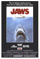
Jaws
  • Simple, effective image, contrast between unaware girl and massive shark attacking
  • Emphasis on the shark rather than the victim – could be anyone
  • Typography – red, danger, blood
  • Actors names – Spielberg not famous at this stage
  • Plays on fame of book
  • Genre – creature feature, slasher as lots of blood perhaps psychological makes you afraid of the water and plays on common fears 


500 days of summer
  • Blue background – relates to Summer’s eyes – relevant to plot
  • Title – pun. Poster plays on both meanings – sun pictures of girl
  • 500 days of summer – collage to represent each day with summer
  • Genre – romance, boy and girl. Boy alone, not happy. Girl related to sunshine and (his) happiness
  • Tag line – ‘this is not a love story, this is a stry about love’ – enigmas and subvert conventions
  • Boy sitting on sketched hill – arty

Final destination
  • tag line- piece of glass, plays on rest in piece
  • related to plot – franchise. Horrible unusual deaths
  • image – mix of face and skull, eerie, grim
  • skull – relevance to death personified (like grim reaper) out to kill those who escaped their fate
  • typography – light in mirror, relates to plot – people look back on premonition and work out how they were meant to die
  • mirror – image. Young, attractive actors who have gruesome deaths
  • colour scheme – dark blue, black, white and a bit of colour. Mysterious because it’s not following traditional conventions
  • New age horror – green and blue tints to create cold, clinical feeling
  • Red – still applicable for slasher

The Dark Knight (Joker)
  • Typography – catch phrase of the Joker, looks like it’s written in blood. Smile makes it more freaky and unsettling, more sinister and sick/psychotic
  •  Gotham in the background – mist, fog, vague. Painted onto a window?
  • Gesturing towards audience. Unnerving, addressing us yet we can’t see him clearly
  • Title of the film and symbol at the bottom – franchise
  • Nothing in the middle positing golden rule, eye is drawn all around rather than at focal point

Terminator
  • Plays on the convention of the golden rule as main image is in the middle however is upside down
  • Eyes are main focus. Red is illuminated – suggesting still alive, contrast to colour scheme – brown, black, cream – natural
  • Takes longer to look at image, twist your head so more time is spent looking at it
  • Typography – metallic, futuristic – robotic and man made
  • Genre – sci-fi horror
The Cabin in the woods
  • Genre – grey scale background, eerie, chilling, enigmas
  • Cabin suspended – rubiks cube, puzzles, psychological
  • Tagline – ‘you think you know the story’ plays on audiences expectations and conventions of horror in the woods genre
  • Conceptual image, simple but has been manipulated to create an interesting image
  • Typography – scratched, thin, elongated, modern classic, simplistic 
The last exorcism
  • Girl not in centre of the poster – ‘the golden rule’, forces eye to look around as not conventional composition is used, makes you look at the poster longer. Unsettling
  • Tagline – ‘if you believe in God, you must believe in the Devil ‘you’ – addresses audience
  • Picture, typography and tagline all relate to eachother
  • Playing on previous success of ‘The Exorcist’ – girl, subverting conventions of youth and innocence
  • Explicit picture of girl possessed – uncomfortable, should expect shocks and jumps as she is in a dangerous threatening position
  • Colour scheme –sepia, green (filthy) neutral natural colours – realism, tiny bit of red (convention is there but background)
  • Font –archaic, gothic- religious
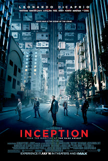
Inception
  • Background – road twists up. Confuses the audience what way we’re looking
  • Genre – sci-fi/fantasy/thriller
  • Tagline ‘your mind is the scene of the crime’ – relates to thriller but ‘mind’ suggests its more abstract
  • Different size given to different actors and director’s name, famous cast so capitalising on this by making this a focus of the poser
  • Colour scheme – blue, clinical or cold.Blue and red – crime like police lights. 
  • Title strong contrast to rest of the poster and stands out against the background


Batman
  • Teaser poster
  • No need for plot franchise will guarantee success
  • Black, white, grey – bleak, creates disequilibrium
  • Comic book used this grayscale colour scheme, film stays true to comic book
  • Rocks falling, action, destruction
  • No title, enigma, forces people to further research creates interest
  • Unusual angle- looking up, we are the people from Gotham – need help
  • Rocks falling towards us, bat shape at top – light. Binary opposition
    Batman (The dark knight rises)
  • Plays on similar image from before, batman symbol in the sky from buildings
  • Tagline ‘a fire will rise’ – matches destruction in image. Instead of light, we have fire – suggests hell
  • Finality, destruction, hopelessness, action, dark
  • His stance is defeatist, standing at the bottom with us   

The Pact
  • Landscape poster – unusual
  • Image of someone coming out from the wall paper - creepy , something lurking reflective of the tagline and perhaps plot but doesn’t give away what the scary thing is, creates enigma
  • Old fashioned wallpaper – old fashioned houses tend to be haunted
  • Tagline ‘are you alone in your house?’ – small font, people look closer to read it lengthens amount of time audience spend looking at poster, use of ‘your’ addresses audience and questions them
  • Colour scheme - conventional use of horror colours black and white, contrasting makes text stand out more against background
  • Typography – ‘PACT’ has more emphasise and has a glowing effect hints at paranormal, ghostly, ethereal   
  • Gives a clear indication of genre as horror to the audience
  • Positioning of elements and use of the golden rule - there isn’t much going on in the centre of the poster, the image is slightly higher, the audiences eye is drawn around the whole poster, spend more time looking. 

Amy Freeman

Poster Research

We will also be making a poster as part of our coursework, so I deconstructed current examples and noted what makes them effective.

Deconstructions


(500) Days Of Summer

  • Theme of poster represents structure of film and coincides with title (title is pun and poster plays on both meanings) --> collage of pictures of Summer
  • Title is clear, bold and easy to read
  • Colours aren’t block/shapes are layered over one another
  • Main character in the bottom corner is not main focus (tells us about character) = suggests he’s artistic as he’s sketching (alone --> not conventional)
  • Character ‘sitting’ on drawn hill with sketchy writing next to it as tagline
  • Tagline: ‘This is not a love story. It is a story about love’. --> subverts stereotype with unique take (enigma)
  • Blue background with sun and pictures in the sky is happy but not cheesy
  • Together with tagline targets the right target audience (e.g. no red for a romance)
  • Steers clear of clichéd rom-com as the focus of the film is that this isn’t a ‘love story’ but rather real life
  • Actors names above in sketchy font not taking away attention from pictures
  • Blue theme fits with blue theme in the film


Jaws

  • Simple image creating terror by showing scale of shark and how human is oblivious
  • Person not a focus meaning it could be anyone creating more fear
  • Red, bold title – represents blood & danger
  • Steven Spielberg not established then so didn’t have his name as a focus but rather popular actors at the time
  • Black, white and red for simple terror
  • Framed image draws attention
  • Promotion: ‘The terrifying motion picture from the terrifying number 1 bestseller’ --> sells the scare factor plus the achievement the story already as (brings to attention it’s a book adaptation
  • Bluntness of scares will attract only an audience who like horror (‘creature feature’/psychological/slasher)
  • No tagline


The Final Destination

  •     The title has a shining light/glimmer to it and together with the mirrors in the main image could connote reflection. This links to the film’s plot in how the characters reflect over the near-death event to uncover future fatalities.
  •     Unlike the title of the film, the release date’s text is red. This keeps in line with the genre of the film and gives the poster more colour. Because it juxtaposes with the rest of the poster, it creates more of an impact.
  •     The background isn't plain black but is in fact has a smoky/foggy effect which depicts more of a mystery and a chill (stepping away from black, red, and white) blue = cold
  •     The main image consists of a screaming woman with the bottom half of her face a skeleton all of which being an image reflected in a smashed mirror. This combined image is most effective as it is not a regular image we’d be used to seeing and it’s slightly gruesome/fearful. The mirror could also be suggestive of how all the characters are young, pretty teenagers revolving around self-image. (shadowed eyes/grim reaper à death personified)
  •     The type of characters narrows down the target audience as this’ll more likely attract teenagers and younger adults
  •     The image is placed in the centre of the poster filling all the space so it is the focus to create the most impact
  •     The tagline: ‘Rest in pieces’ works well with the fragments of broken mirror. It suggests deaths that are gory and gruesome depicting the plot of the film.
  •     The explicitness of the image and tagline narrow audiences down to the target market of those interested in the horror genre which this poster clearly demonstrates.  (teenage slasher)
  •     Tongue –in-cheek/humour --> play on ridiculous deaths 


The Dark Knight Rises

  •     No film title is included on the poster as the franchise logo is well-known and is therefore more effective to not include the title. This also creates more buzz around what the film may be called and will encourage people to research and look into the film
  •     The way the logo has been created is imagery as if the audience are looking up at the sky and can see the Batman logo in the silhouettes of the buildings
  •     The buildings are surrounded by falling rocks representing destruction and creating a sense of disequilibrium and enigma. (messy, action film)
  •     The text that is included though is clear but concise and discrete as so not to take focus away from the main image.
  •     Unusual angle – people of Gotham in need of help (rocks falling towards us)
  •     Binary opposition (bat shape)
  •     The colour scheme is white and grey which gives a bleak and grim look also creating disequilibrium as it does not look bright and joyful. This will steer some audiences away who prefer a more cheerful film
  •     Gotham cast in shadows/full of depression (comic book)
  •     There is no tagline as not to give any clue to the plot as this poster is more of a teaser poster.
  •     The genre is only clear due to the established franchise of which promotion for this film relies. Otherwise this could be interpreted as a horror or even a sci-fi perhaps. 

  •     Plays on teaser trailer
  •     Tagline: A fire will rise --> matches destruction
  •     Fire inside of light (Hell)
  •     Finality, destruction, hopelessness, action, dark
  •     Relate to last film? Franchise
  •     His positioning – protecting us/himself from fire? Given up?


The Last Exorcism

  •      The focus of the poster is a room rather than the girl clinging in the corner of the ceiling (Golden rule) This is to not conform to the convention of the image being in the centre of the poster but in fact averting the audience’s eyes to create more of a surprise/shock impact (unsettling) --> makes eyes look around more so people spend longer looking around
  •     The image is of a girl with long hair covering her face is a white nightgown clinging to the ceiling. Using a young person is a convention of horror films as they can create more of an impact on audiences due to them traditionally not being regarded as a threat. How she is positioned is abnormal and so is freaky/creepy, also suggesting some inhuman presence (as the title suggests). Her face is covered for enigma and terror as the imagination is the best tool for instilling fear in audiences. Her shadow is seen on the dirty grimy walls creating more discomfort within the audience --> shocks/jumps (position of danger/threat)
  •     The font of the title is conceptualised being archaic/Gothic relating to the theme of the film which is exorcisms and the Devil etc. (picture, typography and tagline all relate)
  •     This is also linked to the tagline which is: ‘If you believe in God you must believe in the Devil’. Use of first person targets audiences and makes the audience believe they are being spoken to.
  •     Other than the title the rest of the text is smaller as to not take focus away from the image and title. Some of which is in red to fit aptly into the horror genre suggesting blood (not in the way Saw might) as well as danger. Other than this the rest of the poster is black, white and grey with a green tint which makes a murky image that is dirty and grim perhaps reflecting the storyline. 


The Godfather

  •     Conceptualised/iconic font
  •     Tagline: ominous
  •     Cat links to Bond --> innocent creature in hands of bad guy
  •     Little bit of red
  •     Portrait --> hierarchy 


Alien

  • Typography: spread out, links to space, vast, futuristic, invading space
  • Tagline: ‘In space, no-one can hear your scream’.
  • Positioning (Golden Rule)
  • Makes you look closer (spend longer looking at poster)
  • Unnatural, acidic colours (black, yellow & green) --> scifi


The Dark Knight

  •     Typography: catchphrase/tagline (looks as if written in blood) --> smile makes it more horror/freaky/unsettling) sick/twisted/sinister/psychotic (Joker is iconic character)
  •     Gotham in the background – mist, fog, vague
  •     Painted on window, clotted
  •     Gesturing towards audience – unnerving as cannot clearly see him
  •     Positioning, golden rule


Terminator Salvation

  • Plays on conventions of Golden rule (main image in middle but upside down)
  • Eyes are main focus --> red is illuminated, suggesting still alive ( contrast to colour scheme – brown, black, cream = natural)
  • Background illustrates a fight – action (links to tagline ‘we fight back’)
  • Typographic – metallic, futuristic, robotic, man-made, artificial , reflective
  • Genre – sci-fi/horror (destruction) 


The Cabin In The Woods

  • Genre – grey scale background, eerie, chilling, eerie, enigmas
  • Cabin suspended - (Rubik’s Cube, puzzles, psychological)
  • Tagline – ‘you think you know the story’- plays on audience expectations and conventions of horror in the woods genre
  • Simple image, conceptual
  • Typography – scratched, thin, elongated, modern classy
  • Release date – straight to the point 


Gone

  • Image – picture within a picture within a picture
  • Man just a shadow – no identity
  • Girl looking straight at audience – powerful position (in front of picture of girl’s body, vulnerable)
  • Focus on actress rather than plot
  • Tagline: ‘No-one believes her. Nothing will stop her’ (Mystery over who is victim/villain  --> small/off-centre/capitals)


The Bourne Legacy

  • Landscape poster = unusual
  • Draws eye over whole poster to get information
  • Tagline: ‘There was never just one’ – one assassin
  • Pun on Borne/Born
  • Image with bars – relates to piecing
  • Genre – action/thriller
  • Typography: modern, slick, professional 


Inception

  • Background – road twists up (confuses audience what way we’re looking
  • Genre – sci-fi/fantasy/thriller
  • Tagline: ‘your mind is the scene of the crime’ --> thriller/abstract/puzzles
  • Different size given to different cast/crew
  • Colour scheme – blue (clinical/cold) Blue and red = crime (red = contrast)


Website Research

We will also be making a website as part of our coursework therefore I researched into current examples and noted what makes them effective.

Final Destination 5


Marvel's Avengers Assemble


The Last Exorcism


The Disappearance Of Alice Creed


Ted


Rock Of Ages


The Dark Knight


Grave Encounters


Insidious


Conventions

From deconstructing websites, we devised the follow as conventional features as we sure them appear often:
  • animation/moving backgrounds activated by cursor
  • social networking links
  • downloads (wallpapers/soundtrack)
  • slideshows (photos/reviews/quotes)
  • intro video to website/each section of website
  • background music for atmosphere (could be actual soundtrack)
  • about/cast & crew
  • stylised fonts and themes
  • order online
  • interactive games
  • production company logos
  • register for email updates and exclusive content
  • loading screens
  • related links e.g. production company


Trailer Research

As we will be making a teaser trailer for our coursework, I have researched into current examples and noted what makes them effective.

Definition


  • Trailer – a preview of a film or TV show used to advertise in advance in the form of a (series of) excerpt/s.

  • Teaser trailer (teaser) - a short trailer used to advertise a film, TV show, video game or product, showing basic outline (films may still be in production/editing process).


Difference


  • A teaser is a shorter version of a theatrical trailer with the purpose of enticing the audience (creates enigma) and develop a hype about an upcoming film (posing questions).
  • Theatrical trailers are more in depth, giving more information about plot to the audience.
  • A teaser is released months in advance (up to 18 months) (release date = season) whereas theatrical trailers give exact dates and are therefore closer to release dates (e.g. will state month or exact day).
  • A teaser is usually under 2 minutes whereas a theatrical trailer can be up to 4 or 5 (production companies only allowed to go over 2 and a half minutes once a year.
  • A teaser exploits the reputation and name of director/producer and starring cast.
  • Neither in chronological order (no spoilers and show best bits).
  • Used to be shown at the end (trailer) but people left cinema so put at beginning.
  • Teaser may contain footage specifically made for trailer.
  • Teasers usually only made for high budget or high profile films.
  • Teaser trailers are shown on TV rather than theatrical.
  • Theatrical more likely to include a voiceover. 
  • Big Hollywood action movies have been getting the 1-2-3 treatment: One teaser 6 months in advance, a quick trailer showcasing the last period of production, and a final trailer to wrap up post-production.

 Deconstructions


Snatch 


  • Can tell plot
  • Basic storyline
  • Freeze frames
  • Names of stars
  • Humorous but not best bits
  • Fast paced (with music)
  • Bits from various points in film working together
  • Unique camera shots (in the boot)


The Matrix


  • Close camera angles
  • Explains a little bit of plot
  • Change of editing pace and soundtrack
  • Website
  • Logo
  • Titles 


Prometheus

  • Ridley Scott
  • Titles shows plot
  • Soundtrack and editing 


Scott Pilgrim Vs. The World

  • Editing
  • Titles
  • Soundtrack
  • Change of genre


Quarantine

  • Jumpy bits
  • Storyline
  • Texts involves audience
  • Equilibrium
  • Shocked images
  • Conventions of horror
  • Montage at end


Doghouse

  • Kept charm
  • Fresh cliché
  • Tongue in cheek
  • Change of genre
  • Simple soundtrack
  • Editing – fast paced and fits soundtrack


Insidious

  • Editing
  • Suggestive clues
  • No storyline
  • Lots of changes
  • Changes in pace
  • Typography
  • Shock dialogue followed by loud noise and fast editing


Jennifer's Body

  • Big names
  • Male orientated
  • Soundtrack
  • Feminist 


The Devil Inside

  • Editing
  • Used all best bits
  • Related titles


Buried

  • Thinking outside the box
  • Didn’t play on actor
  • Suspense 


Dark Water

  • Creepy soundtrack (nursery rhymes)
  • Lots of clues – posing enigmas for you
  • Montage
  • Ripple background
  • Academy Award Winner’
  • Transitions
  • Editing to heartbeat
  • Dialogue with image


Tormented

  • Cliché ‘ teenager rebels’
  • Have sex, you die
  • Attempt at genre change
  • Gives away a lot
  • No comedy
  • Relevance of beginning?
  • Creepy end (related to film)


The Pact

  • Sound
  • Editing
  • Reviews
  • Titles 


(500) Days Of Summer

  • plays on comedy
  • Related titles
  • awards


Shutter Island

  • Trailer gives away plot
  • Teaser plays on director 


Devil

  • Montage (elevator music)
  • oxymoron


Spider-man

  • Flash cuts
  • Close up of leading lady (kissing shots/peril)
  • Rock music
  • Stunts/effects
  • Spiderman traits (hand-pose)
  • Narration
  • Concept typography
  • Heartbeat soundtrack
  • Glimpse of villain
  • Sweeping  camera angles 


Scooby Doo: The Movie

  • Introducing characters
  • Focused on already established story/characters so didn’t need to sell actors/actresses
  • Clips showed characters’ personalities
  • Change of genre
  • Concept logo (production company)
  • Traditional narration
  • Fades/flashes
  • Theme song  (modernised)
  • Themed titles 


Men In Black 2

  • 'Same routine’ – clichéd voiceover
  • Editing parallel to sound
  • Pacing stops for long comic sequence
  • Beginning of story told to entice to know more
  • Shots shown match dialogue
  • Titles incorporate action 


The Matrix Reloaded


  • Titles/narration advertising film in relation to audience
  • Concept titles/logos
  • 'here we go’ introducing exciting trailer
  • Flashcuts 


Alien

  • Slow pacing -> reveals title and surprising screeching soundtrack
  •  begins when object is shown
  • No dialogue
  • Builds up pace & becomes more 
  • and more dangerous
  • Doesn’t show enemy
  • Close up of characters without giving away anything
  • Loud distressing noises when images become more distressing
  • Silence -> slogan 


28 Days Later

  • Short, quick images to cause distress
  • Rock soundtrack
  • Serious narration
  • Long shots to show isolation
  • Dialogue from film to show emotion and some plot 


Daisy Edwards