Tuesday 12 March 2013

Evaluation Question 1

In what ways does your media products use, develop or challenge forms and conventions of real media products?


Horror Trailer


  • To get to grips with how a horror trailer would usually look in order to make ours effective as possible, we all deconstructed several appropriate trailers from films that linked well to our concept.
  • We found that a general structure for the trailers started with equilibrium to give the audience a false sense of security followed by disequilibrium at the climax. We used this convention by beginning the trailer with the victims on a usual day before they are captured, which is when the disequilibrium begins with uncomfortable and disturbing images of their torture.
  • This is also when it begins to change pace from slow to fast-paced.
  • Our trailer also finishes with a scare after the title & release date which is conventional for horror (see picture below)
  • Slasher horrors use lots of disgusting images including blood and gore which is achieved in our trailer through use of 'Chelsea Grin’ make-up and the action of hammering a nail into a victim’s eye (see picture below)


  • We developed this convention by not showing too many shots of the actual torture as it creates a big impact when the torture is suggested and the horror is left to the imagination. (see The Loved Ones Trailer


  • We didn’t sacrifice any gore though as we used close-up shots of live maggots covering mouldy food for added disgust. 


  • Not showing too much of the storyline is important to a teaser trailer as it’s simply meant to entice the audience and develop hype before the theatrical trailer is released.
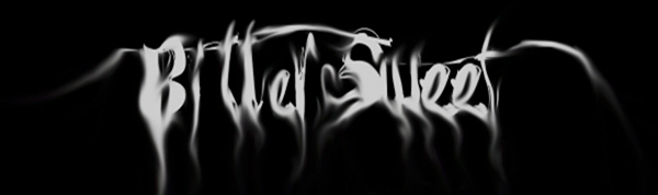
  • In terms of typography for the titles, we decided to subvert the stereotype of blood-red and  chose pink to relate to the antagonist’s girly personality that makes her an unexpected villain (see below)

Antagonist


  • In modern horror films, the type of character who’d be stereotyped as weak or innocent has become the villain and in some cases used to create scares, for example scary children (Orphan, The Ring).


  • We decided to conform to this new trend and use a teenage girl as the antagonist which is essentially subverting the typical stereotype of a killer.
  • Using a young girl as this type of villain is unexpected because of the media’s representation of women as the victims.
  • It’s not unusual for the female antagonist to be sexualised, however we decided to subvert this stereotype by giving our antagonist child-like qualities that develop on the typical creepy child (done through sound of jewelry box, mise en scene and her costume)


Sound

  • As part of the equilibrium at the beginning of the trailer, we used a recording of a jewellery box which conforms to child-like/creepy/chilling sounds (blog-post); we then developed the convention by reversing the sound so it became very distorted to reflect the manic main character
  • Throughout trailers, a ‘booming’ noise can be heard on reveals which is what we included in our soundtrack by adding a synthesized drum beat when the titles appear 
  • When looking at trailers for inspiration for a soundtrack, we found that horror trailers used layered sound effects rather than a song; therefore we did the same using Logic for the manic scenes in our trailer.


Evaluation: Question Two - How effective is the combination of your main product and your ancillary texts?

How effective is the combination of the main product and ancillary texts?
Typography
  • For both the main product and the ancillary texts the title typography was consistent. We used the same font for the website, the end of the teaser trailer and the poster.  (Title)
     This keeps within part of the overall theme of all of the texts of a ‘smokey’ effect, which ties in with the birthday party, and the birthday cake with the candles smoking on the poster (Final Poster)
  • The typography of the titles in the teaser trailer and the tagline in the poster (Tagline) were the same font which was a block lettering this meant that it was consistent throughout. We chose to use a bright pink colour for the typography so that it carried on the running theme of a girl’s birthday party.

Party Theme.
  •  For both the poster and the website we used a picture of our antagonist holding a birthday cake, we also only lit one of the candles so that her face was partially lit however she was still easily recognizable (Poster Photoshoot). This meant that the focus was on the main protagonist and her girlish nature. Using a large picture of her staring right at the camera was also effective as it emphasised her creepy nature.
  • From the mise en scene to the typography the girlish childlike party theme is consistent. Throughout the teaser trailer we focused on the mise en scene being bright, colourful and over the top especially with the ‘Birthday party’ scene (Birthday Party). 


  • For the poster we had a big birthday cake with multi coloured candles which emphasised the party theme. On the website we incorporated a party invite at the top of the website (Website Typography) we also had ‘RSVP’ typed next to all of our social networking hyperlinks. This shows the girls birthday party theme is spread throughout our main product and ancillary texts.

Horror Theme
  • Although we had a ‘party theme’ throughout all three products, our genre is horror/slasher, which meant that those elements had to consistent throughout too.
  • Grotesque elements were consistent throughout, as in trailer we filmed food which had live maggots covering it. (Mouldy Food)


     For both the poster and the website we used the picture of our main antagonist holding a mouldy and old cake which enhanced the gruesome elements.
  • On our website we focused more on the party elements of our trailer with the party invite, so horror elements were not a main focus.

Evaluation Question 3 – What have you learnt from your audience feedback?

Our social message we wanted to our teaser trailer to convey to our audience was the stress placed on young people, the pressure of being popular.
To develop this theme into a more concise concept for a film idea we researched our target audience to see what they would want.
  • We distributed a survey amongst teenagers within the age bracket of 16 to 19, as this is who we chose to be our target audience.
  • Gained a better understanding of what our demographic would expect from our chosen genre of slasher horror.
  • The purpose of our survey was to use it to start developing specific ideas for our trailer which our target audience would find appealing.
  • Some questions we asked were supportive of our previous research, for example asking about female antagonist was reflective of our deconstructions into horror films with female killers such as Jennifer's body and The loved ones.
  • The survey was a way to help decide how we should storyboard our trailer, fast or slow paced and what the main focus should be; characters, locations or action. 
  • We decided to gradually build pace from slow to increasingly fast, further trailer deconstructions like The Hunger games showed this to be a convention also.
  • We did not know where our main focus should be but from audience feedback we were surprised to see that our audience wanted an establishment of characters within the trailer alongside action.
  • We formed our storyboard around this idea as at the start of our trailer we have shown our victims as well as antagonist before fast paced torturous action building towards the end of the trailer. 
  • One thing we chose to ignore from the results was the audience’s preferred age of the victims which was mixed ages. 
  • Our original concept of having a ‘family’ as the victims fitted the majority of the audience’s opinion however casting was difficult and unreliable so we decided to have teenage victims as they were more accessible actors so went about casting 'friends'.
  • The questions which assisted us the most were mise en scene, music and location as they helped narrow down the specifics of our trailer.
  • Unsure of location of our trailer, whether it be set exteriorly or internally, and if more than one location would be needed 
  • Audience response was that both exteriorly and internally locations wanted to be seen. 
  • We followed this, so the first half of the trailer establishing characters was outside in our chosen exterior location and the torture scenes in an internal dungeon location reflecting the forced confinement of the victims and their entrapment.
Music 
  • We were unsure of what music would be suited to the trailer and so this was an area in particular we wanted to see our target audience’s response.
  • 53% voted slow, creepy music would be most effective so we used jewellery box music which was very unsettling alongside torture. 
  • 51% of our audience said that screaming sound effects would be most appropriate, so we used this sound effect to end the trailer.
  • Also found this to be conventional of horror trailers to leave the audience with a jumpy scare.
  • We wanted our trailer as it was going to be fast paced jump cuts to be visually exciting so our mise en scene needed to be effective.
  • We researched whether our audience would find face make up effective to create a scary, horrifying effect. 
  • The result being 90% made us continue with this idea and test different make up looks to see which would work best, one being face paint and the other 3D gel.
  • Our final make up looks as though a smile has been cut into the victims face, this created the most horrific, gruesome result.
The audience feedback was helpful in assisting our decisions about what our trailer should consist of and how it should look in order to be an effective horror trailer which is appealing to its target audience.

Amy Freeman

Monday 11 March 2013

Evaluation Question 4- How did you use media technologies in the construction and research, planning and evaluation stages?

Sound


  •         We used You Tube to research sound in teaser trailers and find any conventions or inspirations when carrying out  deconstructions 
  •         You Tube  was also used in conjunction with  Sound Cloud   to search for uncopyrighted music and sound effects that we later planned to edit and fit to our trailer. However, we did not find any that were appropriate and therefore went on to develop our own sounds.
  •          We used LogicPro to layer and combine individual sounds and recorded an audio file of a Music Box  as this was specific and unique to our teaser trailer and fitted with the opening shots of our antagonist playing with a music box as well as reflecting the child like themes. During postproduction we rewound the sound and edited speed in order to create distortion and add horror aspects too the innocent sound.


  •  Using iMovie, we then inserted our sound and cut the sound to fit to the image of the trailer.

   Typography
  •          To create the main title Title  we used website “myfonts.com” and downloaded the original font. Using Photo Shop we edited the font with “smudge” and “blur” effects to distort it and achieve a smokey effect, which was very effective and consistent with the birthday party theme, especially for the poster as it works parallel to the image of the birthday cake.

  •         When creating typography for the tag lines and titles, we had followed conventions found in our research and chose the colour red. However, we felt that we could challenge these forms and pursue our girly child like themes by making the titles a hot pink colour.  Too add a horror aspect, we used a satin effect which creates effects and adds tone to the typography.


        Internet
  •  During research and planning we used many websites such as IMDB, You Tube and Sound Cloud. For Construction our teaser trailer, website and poster we used My fonts, Wix.com and iPiccy. We have used Blogger to document all of this research and production.
  • Website iPiccy editing tools such as contrast made our Poster  vibrant, fitting with the party theme.

  • Wix.com allowed us to make a user friendly website as well as adding feeds from social networking sites such as Twitter , conforming to modern conventions of having links to social networking sites and helping us to appeal to our young audience by using similar technologies to them.


Equipment

  •  We used Studio Lighting lamps when filming at our interior dungeon location, as there was no natural lighting. We carried out Video Tests to determine which type of lighting would be most appropriate for each scene. This allowed us to create shadows and glares adding to the horror aspect of our teaser trailer. 
  • We filmed some of the apple bobbing torture scene using an underwater camera Underwater Camera   as we thought that this would be effective for showing the agony of the victim as well as disorientating the audience from an unusual angle. However, when editing we found that shots were too close due to the depth of the container that we used. Despite refilming several times and trying different containers and methods, we were unsuccessful and therefore used small snippets of the underwater shots combined with mid shots of the victims head being forced into the apple bobbing bowl.


Making a soundtrack.


  • For part of our trailer we wanted to make a sound track from scratch so that it was completely original. For this we used 'LogicPro' so that we could make and combine different sounds to make a track.
  • To start with we used a keyboard to make certain sounds, the track had to be around 20 seconds long so we started with an underlying sound as a bass. 
  • We then started experimenting with different sounds from the keyboard by changing the pitch and style of sound. On 'Logic' you are able to change the settings so that you press down on a key on the keyboard and it makes a completely different sound for example, a bell ringing. 
  • We then downloaded different sound effects e.g. Saw-FX, which was sawing sound, we repeated this sound so that the horror effect was enhanced.
  • There was a total of 15 individual sound effects which we edited together to make our soundtrack, and for some of them we synthesised the sound, or added a deeper bass so that is sounded creepier. For the 'Bassline3' (see above) we increased the volume so that it became a deeper bass sound.                                                                                        For some of the sounds I layered them over each other so that the soundtrack increased its intensity as the trailer went on.
  •  

Sunday 3 March 2013

Website: Adding Image, Typography and Twitter Feed

To make navigating more user friendly I used the "Advanced Styles" menu to highlight a link in a different colour when the mouse scrolls over it. Originally, I chose red to conform to horror conventions  but after discussion we changed this to a hot pink colour to play on the themes of our girly antagonist.


Adding an Image
Using the "add" option I selected "image without frame" and uploaded from our file of photos from the shoot for the poster.
We chose to use a different picture from the poster that was not overly edited but was still effective for making the audience feel uncomfortable.


I then used the dragging tools to make the picture very large and positioned it at the side of our webpage.


Adding Typography

I used the same process for adding our title as I did for adding the image. 
Add> Image> Image without Frame


When positioning the typography I chose the option of "send to back" as the black background of the image slightly overlapped the other text on the homepage.

Twitter Feed

Social convergence are a common convention on all film websites and we had already added links to Facebook, Twitter, Youtube, Pintrest, Google Plus and RRS.
However, we felt that because of the increasing power and popularity of social networking, we should have a live twitter feed on our homepage.

Firstly, I created a Twitter account for bitter sweet using the film poster as a picture and writing a short bio.

Using the "Add" feature I selected "Social Networking" and "Twitter Feed"
I connected this to our twitter by inserting the username of the Bitter Sweet twitter page, selected the number of tweets to be shown (5 as to not take up too much room) and positioned the feed on the Homepage.


Website Plan

The criteria for our website:

  • User Friendly
  • Trailer must play automatically on homepage
  • Only fit to one web page


This image shows the planned layout and colours of our homepage on the website.


  • Black background- conforms to conventions of horror genre and plain allows other creative features to show up well.
  • Image of antagonist- will be large at side of page, divereting the audiences attention and create the feeling of being watched. Will also use a similar image to the poster to create continuity.
  • Typography- The same used on the poster makes it consistant and recognisable.
  • Other Text- "You are invited to Lucy's" "Birthday Party" "RSVP here..."ned as small white font. We have now decided to make a simple typography for this text that will be the same as our tag line on our poster. This will be consistant in a hot pink colour, playing on the horror conventions of using subliminal red and adapting it to fit with the girly personality of our antagonist.
  • Links to social convergance- a common convention all film website, ideal for us to connect with a young audience using social networking.
  • Trailer playing automatically- making the website user friendly and a useful way of intreauging the audience and ensuring that they see the trailer.
  • Critic quotes- a common convention of all film websites to create hype about the film by reassuring and persuading the audience.