Poster Research
We will also be making a poster as part of our coursework, so I deconstructed current examples and noted what makes them effective.
Deconstructions
(500) Days Of Summer
- Theme of poster represents
structure of film and coincides with title (title is pun and poster plays on
both meanings) --> collage of pictures of Summer
- Title is clear, bold and easy to
read
- Colours aren’t block/shapes are
layered over one another
- Main character in the bottom
corner is not main focus (tells us about character) = suggests he’s artistic as
he’s sketching (alone --> not conventional)
- Character ‘sitting’ on drawn hill
with sketchy writing next to it as tagline
- Tagline: ‘This is not a love
story. It is a story about love’. --> subverts stereotype
with unique take (enigma)
- Blue background with sun and
pictures in the sky is happy but not cheesy
- Together with tagline targets the
right target audience (e.g. no red for a romance)
- Steers clear of clichéd rom-com
as the focus of the film is that this isn’t a ‘love story’ but rather real life
- Actors names above in sketchy
font not taking away attention from pictures
- Blue theme fits with blue theme
in the film
Jaws
- Simple image creating terror by
showing scale of shark and how human is oblivious
- Person not a focus meaning it
could be anyone creating more fear
- Red, bold title – represents
blood & danger
- Steven Spielberg not established
then so didn’t have his name as a focus but rather popular actors at the time
- Black, white and red for simple
terror
- Framed image draws attention
- Promotion: ‘The terrifying motion
picture from the terrifying number 1 bestseller’ --> sells the scare factor
plus the achievement the story already as (brings to attention it’s a book
adaptation
- Bluntness of scares will attract
only an audience who like horror (‘creature feature’/psychological/slasher)
- No tagline
The Final Destination
- The title has a shining light/glimmer
to it and together with the mirrors in the main image could connote reflection.
This links to the film’s plot in how the characters reflect over the near-death
event to uncover future fatalities.
- Unlike the title of the film, the
release date’s text is red. This keeps in line with the genre of the film and
gives the poster more colour. Because it juxtaposes with the rest of the
poster, it creates more of an impact.
- The background isn't plain black
but is in fact has a smoky/foggy effect which depicts more of a mystery and a
chill (stepping away from black, red, and white) blue = cold
- The main image consists of a
screaming woman with the bottom half of her face a skeleton all of which being
an image reflected in a smashed mirror. This combined image is most effective
as it is not a regular image we’d be used to seeing and it’s slightly
gruesome/fearful. The mirror could also be suggestive of how all the characters
are young, pretty teenagers revolving around self-image. (shadowed eyes/grim
reaper à
death personified)
- The type of characters narrows
down the target audience as this’ll more likely attract teenagers and younger
adults
- The image is placed in the centre
of the poster filling all the space so it is the focus to create the most
impact
- The tagline: ‘Rest in pieces’
works well with the fragments of broken mirror. It suggests deaths that are
gory and gruesome depicting the plot of the film.
- The explicitness of the image and
tagline narrow audiences down to the target market of those interested in the
horror genre which this poster clearly demonstrates. (teenage slasher)
- Tongue –in-cheek/humour --> play on ridiculous deaths
The Dark Knight Rises

- No film title is included on the
poster as the franchise logo is well-known and is therefore more effective to
not include the title. This also creates more buzz around what the film may be
called and will encourage people to research and look into the film
- The way the logo has been created
is imagery as if the audience are looking up at the sky and can see the Batman
logo in the silhouettes of the buildings
- The buildings are surrounded by
falling rocks representing destruction and creating a sense of disequilibrium
and enigma. (messy, action film)
- The text that is included though
is clear but concise and discrete as so not to take focus away from the main
image.
- Unusual angle – people of Gotham
in need of help (rocks falling towards us)
- Binary opposition (bat shape)
- The colour scheme is white and
grey which gives a bleak and grim look also creating disequilibrium as it does
not look bright and joyful. This will steer some audiences away who prefer a
more cheerful film
- Gotham cast in shadows/full of
depression (comic book)
- There is no tagline as not to
give any clue to the plot as this poster is more of a teaser poster.
- The genre is only clear due to
the established franchise of which promotion for this film relies. Otherwise
this could be interpreted as a horror or even a sci-fi perhaps.
- Plays on teaser trailer
- Tagline: A fire will rise --> matches destruction
- Fire inside of light (Hell)
- Finality, destruction, hopelessness, action, dark
- Relate to last film? Franchise
- His positioning – protecting us/himself from fire? Given up?
The Last Exorcism

- The focus of the poster is a room rather than
the girl clinging in the corner of the ceiling (Golden rule) This is to not
conform to the convention of the image being in the centre of the poster but in
fact averting the audience’s eyes to create more of a surprise/shock impact
(unsettling) --> makes eyes look around more so people spend longer looking around
- The image is of a girl with long
hair covering her face is a white nightgown clinging to the ceiling. Using a
young person is a convention of horror films as they can create more of an
impact on audiences due to them traditionally not being regarded as a threat.
How she is positioned is abnormal and so is freaky/creepy, also suggesting some
inhuman presence (as the title suggests). Her face is covered for enigma and
terror as the imagination is the best tool for instilling fear in audiences.
Her shadow is seen on the dirty grimy walls creating more discomfort within the
audience --> shocks/jumps (position of danger/threat)
- The font of the title is
conceptualised being archaic/Gothic relating to the theme of the film which is
exorcisms and the Devil etc. (picture, typography and tagline all relate)
- This is also linked to the
tagline which is: ‘If you believe in God you must believe in the Devil’. Use of
first person targets audiences and makes the audience believe they are being
spoken to.
- Other than the title the rest of
the text is smaller as to not take focus away from the image and title. Some of
which is in red to fit aptly into the horror genre suggesting blood (not in the
way Saw might) as well as danger. Other than this the rest of the poster is
black, white and grey with a green tint which makes a murky image that is dirty
and grim perhaps reflecting the storyline.
The Godfather
- Conceptualised/iconic
font
- Tagline: ominous
- Cat links to
Bond --> innocent creature in hands of bad guy
- Little bit of
red
- Portrait --> hierarchy
Alien

- Typography: spread out, links to
space, vast, futuristic, invading space
- Tagline: ‘In space, no-one can
hear your scream’.
- Positioning (Golden Rule)
- Makes you look closer (spend
longer looking at poster)
- Unnatural, acidic colours (black,
yellow & green) --> scifi
The Dark Knight

- Typography: catchphrase/tagline
(looks as if written in blood) --> smile makes it more horror/freaky/unsettling)
sick/twisted/sinister/psychotic (Joker is iconic character)
- Gotham in the background – mist,
fog, vague
- Painted on window, clotted
- Gesturing towards audience –
unnerving as cannot clearly see him
- Positioning, golden rule
Terminator Salvation

- Plays on
conventions of Golden rule (main image in middle but upside down)
- Eyes are main
focus --> red is illuminated, suggesting still alive ( contrast to colour scheme – brown,
black, cream = natural)
- Background
illustrates a fight – action (links to tagline ‘we fight back’)
- Typographic –
metallic, futuristic, robotic, man-made, artificial , reflective
- Genre –
sci-fi/horror (destruction)
The Cabin In The Woods

- Genre – grey scale background,
eerie, chilling, eerie, enigmas
- Cabin suspended - (Rubik’s Cube,
puzzles, psychological)
- Tagline – ‘you think you know the
story’- plays on audience expectations and conventions of horror in the woods
genre
- Simple image, conceptual
- Typography – scratched, thin,
elongated, modern classy
- Release date – straight to the
point
Gone
- Image – picture within a picture
within a picture
- Man just a shadow – no identity
- Girl looking straight at audience
– powerful position (in front of picture of girl’s body, vulnerable)
- Focus on actress rather than plot
- Tagline: ‘No-one believes her.
Nothing will stop her’ (Mystery over who is victim/villain --> small/off-centre/capitals)
The Bourne Legacy

- Landscape poster
= unusual
- Draws eye over
whole poster to get information
- Tagline: ‘There
was never just one’ – one assassin
- Pun on Borne/Born
- Image with bars
– relates to piecing
- Genre –
action/thriller
- Typography:
modern, slick, professional
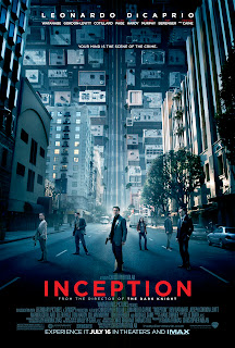
Inception

- Background – road twists up
(confuses audience what way we’re looking
- Genre – sci-fi/fantasy/thriller
- Tagline: ‘your mind is the scene
of the crime’ --> thriller/abstract/puzzles
- Different size given to different
cast/crew
- Colour scheme – blue
(clinical/cold) Blue and red = crime (red = contrast)


No comments:
Post a Comment