Showing posts with label Amy Freeman. Show all posts

Tuesday, 12 March 2013

Evaluation Question 3 – What have you learnt from your audience feedback?

Our social message we wanted to our teaser trailer to convey to our audience was the stress placed on young people, the pressure of being popular.
To develop this theme into a more concise concept for a film idea we researched our target audience to see what they would want.
  • We distributed a survey amongst teenagers within the age bracket of 16 to 19, as this is who we chose to be our target audience.
  • Gained a better understanding of what our demographic would expect from our chosen genre of slasher horror.
  • The purpose of our survey was to use it to start developing specific ideas for our trailer which our target audience would find appealing.
  • Some questions we asked were supportive of our previous research, for example asking about female antagonist was reflective of our deconstructions into horror films with female killers such as Jennifer's body and The loved ones.
  • The survey was a way to help decide how we should storyboard our trailer, fast or slow paced and what the main focus should be; characters, locations or action. 
  • We decided to gradually build pace from slow to increasingly fast, further trailer deconstructions like The Hunger games showed this to be a convention also.
  • We did not know where our main focus should be but from audience feedback we were surprised to see that our audience wanted an establishment of characters within the trailer alongside action.
  • We formed our storyboard around this idea as at the start of our trailer we have shown our victims as well as antagonist before fast paced torturous action building towards the end of the trailer. 
  • One thing we chose to ignore from the results was the audience’s preferred age of the victims which was mixed ages. 
  • Our original concept of having a ‘family’ as the victims fitted the majority of the audience’s opinion however casting was difficult and unreliable so we decided to have teenage victims as they were more accessible actors so went about casting 'friends'.
  • The questions which assisted us the most were mise en scene, music and location as they helped narrow down the specifics of our trailer.
  • Unsure of location of our trailer, whether it be set exteriorly or internally, and if more than one location would be needed 
  • Audience response was that both exteriorly and internally locations wanted to be seen. 
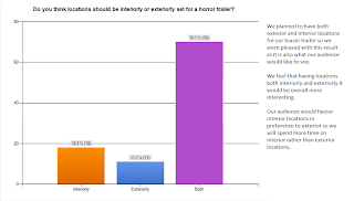
  • We followed this, so the first half of the trailer establishing characters was outside in our chosen exterior location and the torture scenes in an internal dungeon location reflecting the forced confinement of the victims and their entrapment.
Music 
  • We were unsure of what music would be suited to the trailer and so this was an area in particular we wanted to see our target audience’s response.
  • 53% voted slow, creepy music would be most effective so we used jewellery box music which was very unsettling alongside torture. 
  • 51% of our audience said that screaming sound effects would be most appropriate, so we used this sound effect to end the trailer.
  • Also found this to be conventional of horror trailers to leave the audience with a jumpy scare.
  • We wanted our trailer as it was going to be fast paced jump cuts to be visually exciting so our mise en scene needed to be effective.
  • We researched whether our audience would find face make up effective to create a scary, horrifying effect. 
  • The result being 90% made us continue with this idea and test different make up looks to see which would work best, one being face paint and the other 3D gel.
  • Our final make up looks as though a smile has been cut into the victims face, this created the most horrific, gruesome result.
The audience feedback was helpful in assisting our decisions about what our trailer should consist of and how it should look in order to be an effective horror trailer which is appealing to its target audience.

Amy Freeman

Monday, 25 February 2013

Website typography


For the website we needed to create typography for the quotes and also additional titles.

I used the same font design as the poster for the additional titles 'You're invited to Lucy's birthday party'.

I once again used Photoshop to edit this title to look the same as the tagline on the poster and trailer. This kept the titles consistent throughout all the products we have created.

For the quotes they needed stand out against the black background so thought white would do this best but I used the satin effect on Photoshop once again to create the tonal effect so the text didn't look so flat.
The font is in italics which highlights more so that it has been quoted. 


Amy Freeman


Final website

Our final website includes the same image, typography and bright pink colour scheme as the poster to keep a sense of continuity and consistency. 

After looking into other film websites we noticed they include lots of social networking links so we included Facebook, Twitter, YouTube, Pinterest and Google+ links. 
As well as this a twitter feed showing current tweets made about Bitter Sweet. 

Another convention is to have quotes about the film and ratings displayed on the website.

This is the website address for our film website which promotes our teaser trailer.

http://amyamydaisylibby.wix.com/bittersweet


Amy Freeman

Sunday, 10 February 2013

Editing - Underwater


  •  We used an underwater camera for the bobbing for apples drowning scene
  • We wanted to use an underwater camera to show the victim and we thought it would be effective within our trailer
  • When we came to edit the underwater footage we found that because the container we used was fairly shallow, the actors face was very close up and was sometimes unclear
  • When editing we decided to show more footage of the actors face plunging into the water instead as this was more effective and much clearer
  • We also tried reversing the footage of the actor bringing their head up from the water to see if this looked better
  • We chose to include also an over the shoulder shot of the antagonist forcing the victims head under the water to show that it is bobbing for apples which reflected the torturous party element
Amy Freeman


Sunday, 3 February 2013

Final poster design


This is our final poster design which has been edited using Adobe Photoshop and iPiccy a free online photo editing website.

I firstly edited the photo on iPiccy increasing highlights and shadows to make it look more dramatic. I also increased the vibrancy of the colours in the photo. 


All fonts were found on MyFonts and have been minipulated on Photoshop make the typography look designed and overall more professional looking. The idea of the typography was to make it look like wispy candle smoke and so I used the smudge and blur tools to achieve this look on both the title 'Bitter Sweet' and 'coming soon'.


For our tagline 'It's all fun and games' I used a simple bold font as this is what I noticed was conventional from my poster research. I put this in pink to twist the horror convention of typically having red and to suggest the girly/princessy element of our trailer. I used a satin effect on photoshop to create tone on the tagline image rather than one flat colour. By having the tagline to the positioned to the side of the image it draws the eye around the poster.


At the bottom of the poster to make it look more professional I added some production titles also.

Overall I think the poster does convey what we wanted to suggest of our trailer and does follow certain conventions to make it effective for the genre.

Amy Freeman   

Poster photoshoot

  • Our final poster is having our antagonist holding a grotesque, disgusting, mouldy looking cake 
  • We want our antagonist to have vibrant make up on to create a princess, girly appearance
  • The antagonist will be looking directly into the camera as this will look the most scary and creepy
  • Also having the antagonist bend there head down slighty created a more intense look
  • The lighting for the poster will be candle light so that there are dark shadows creating enigma as to who the character is
  • We varied the amount of candles lit as we found when they were all lit the surface of the cake became too bright and the detail was lost and so the mouldy surface was not noticeable
  • We found having one back candle lit up the face the best and created the right amount of shadow but also lit the cake so we could see the mouldy detail
  • We are pleased with the result of the photoshoot and choose one image to for our poster
Amy Freeman

Poster photoshoot - preparation

For our poster we are having a grotesque, rotten birthday cake to create the horror aspect and suggest the birthday theme. 

Stages:
  • Firstly I dug parts out of the cake and then made these parts of the cake look mouldy by using green food colouring
  • I used a paintbrush to apply the food colouring and also put some of it around the holes also
  • I decided that there wasn't enough tone so added some brown paint to the food colouring to make a murky colour which looked more mouldy
  • I made sure I did this all over the cake including the sides
  • The I melted down the candles to get the wax melted down the sides of the cake
  • Some of the candles melted down to stubs which looked quite effective for making it look exaggerated and grotesque
  • The heat of the candles melted the icing also so it was also dripping down the sides which I didn't know would happen but looked very effective as this merged the food colouring with the icing better which made it look mouldy
Amy Freeman

Typography

Original font
To look for fonts which would be suitable for our typography I used the website MyFonts.


Blurred font 
After our idea of using melted, dripping wax for the title I looked more into creating a smokey look for our typography.

This was continuing from the candles idea and to try acheive a more eerie, spooky effect.

I used Photoshop to edit and minipulate the orginal font from MyFonts.
I used the blur tool and smudge tool to change the font to create different possible typography looks. 

Smudged font
 
 Amy Freeman

Saturday, 2 February 2013

Typography idea


This is further testing for our typography from Libby's initial typography research into using melted candle wax.

I used hot glue initially to make the 'Bitter Sweet' so that it was raised becoming easier to see.

I then melted wax dripping it over the title, using white candles firstly to make the title noticeable on the black background. 
I then used red, blue, green and yellow candles to add colour.

When I edited the photo to make the black background darker the title became unclear and not easily readable. 

It did not work out as I'd hoped when edited so will not be used for our typography however was helpful showing we should use a font rather than hand drawn typography. 

Amy Freeman 


Poster initial ideas

After looking at posters of existing films of our film type (horror, female antagonist) we started to think of ideas for our film's poster. We wanted to include hints as to what our film is about. We initially discussed possible ideas linking to out party theme and what could work for a film poster.

Possible ideas:
  • Antagonist holding mouldy, disgusting birthday cake so candles illuminate her face - eerie effect given from the candle light creating shadows
  • A party invitation 
  • Overall image of party table with victims - over exaggerated mise en scene with party decorations but gruesome element of tortured guests
After looking more at the examples and our ideas we decided what we wanted from our poster. Including:

  • Antagonist - forefront of poster, main image
  • Designed typography rather than standardised font
  • Details such as production company titles and names to give an overall more professional look
  • Decide whether we would want to have a tagline
  • Gives hints to our plot - have a birthday theme within the photograph
  • Have a gruesome/grotesque element to portray the horror genre
Amy Freeman

Thursday, 31 January 2013

Poster inspiration


All of these posters have female antagonists which is the same as our teaser trailer so have drawn on these films in particular as a source of inspiration. Each of these posters have the antagonist clearly shown face on to the viewer, this tells me that character must be established in teaser posters especially. The positive aspects I notice from these posters I will consider when designing the poster for our teaser trailer 'Bitter Sweet'.

Orphan
  • Close up of the antagonist 'Esther' directly face on looking straight at the viewer - draws your attention to her even though it is uncomfortable for viewer as she appears to be staring at you
  • Her eyes have been edited darker so that from a distance they appear to be all black creating a demonic look, the highlights on the face have also been heightened to make her brighter, more noticeable and shadows more defined
  • Edges of the poster have been blurred slightly to draw focus subtly inwards to the clear, illuminated face 
  • Poster is very symmetrical and everything is centred, almost in a line starting from her hair parting straight down
  • Colour - blue is a calm colour which dominants the poster but contradicts the genre of the film however it is contrasted with the deep red neck choker which is a common colour for horror
  • Typography 'Orphan' is of mixed letter cases and looks scribbled like a child's writing which reflects themes of the film
  • Has a tagline in smaller case to the the title of the film
  • Taglines create enigma as to who this character is, children usually are innocent but we are told that 'there's something wrong with Esther'
  • Has production company names small at the bottom of the poster   
Carrie
  • Again a close up image of the antagonist 'Carrie' although she appears to be looking down slightly into the camera
  • Direct eye contact with the viewer which creates an uncomfortable feeling 
  • The tears and blood on her face mirror one another but poster is not completely symmetrical 
  • Her hair frames the poster also 
  • Bold, noticeable image of a cross on her necklace which gives the audience a clue towards the character 
  • Editing has created more drastic shadows and highlights in the image
  • Colour is quite dull and greyish on her face but the blood creates the horror aspect and recognises the genre 
  • Poster is once again centralised with the titles centred 
  • Tagline is small above the title
  • Typography shows a crack running through it which hints to the character once more
  • Coming soon is included
Jennifer's Body
  • Antagonist's face in this poster is only partially shown which creates enigma as to who they actually are
  • Viewer is directly drawn to the bold image of the red lips - connotations of image being seductive, alluring and sexual 
  • The blood dripping from the antagonists mouth however suggests the horror genre 
  • Image has been edited to look almost cartoon like rather than realism 
  • Dark hair and bright lips contrasts to the pale white skin - reminder of snow white look perhaps
  • Typography looks like a high school varsity font giving hints to the films plot and setting
  • Titles use previously popular, successful film 'Juno' to interest viewers as it from the creators 
  • 'Megan Fox' is also used to draw in possible viewers
  • The title also 'Jennifer's body' is possibly suggestive alongside the seductive image which would show this is a sexualised horror film 
The Loved Ones
  • This poster depicts the antagonist although she is at a different angle compared to the other posters looking more down the camera lens following the line of the drill she is holding
  • The editing of the poster has blurred more of the background so that viewers focus mainly on the drill and antagonists face before looking more at the background showing disco ball and lights
  • Antagonist seems sweet and princess like because of what she is wearing but the drill pointing directly at the viewer makes her look torturous 
  • We are looking up at her so she is in a powerful position which hints towards her character
  • Typography subverts horror convention but instead is pink and girly 
  • Tagline 'Prom can be torture' provides a clue to the plot
  • Uses 'coming soon' 
After looking at these poster examples I can take from them that for a teaser poster it is important to establish character. I found that these posters were effective as they simply used the antagonists face. The posters are unsettling and uncomfortable, reflecting the genre, for the viewer by having them looking directly into the camera. This is something we would apply to our poster by including our antagonist and hints towards the plot and character. Taglines are also important to suggesting plot and typography is creatively done to convert or subvert genre. 

Amy Freeman

Monday, 28 January 2013

Sound research - Soundcloud


  • For our sound we want to have a creepy, eerie feeling and so wanted to have slower music which builds towards the end of the teaser trailer
  • Want to create a sense of enigma in our trailer and so the slower paced music would perhaps be best for this
  • The music also needs to relate and be parallel with the action so as the torturous more violent scenes happen the music needs to match this
  • We will have to decide whether we want to use a more up tempo track to contrast with the slower music at the start or to add dramatic sound effects to heighten the tension in the trailer
  • In order to find unsigned music and sound I used SoundCloud
  • I started by searching words such as eerie, dark, creepy, scary. I found some tracks which would be suitable for when we begin to edit music and sound.
  •  
  • This track provokes an eerie sense which is what we wanted from the music
  • The low echoey booms would be fitting to whenever there is a dramatic part in the trailer 
  • Builds pace gradually 
  • Low whistling noises making it scary and more mysterious
  •  
  • Slow piano 
  • Nursery rhyme - fits with previous sound idea to have lullabies/childrens rhymes
  • Does not have any dramatic booms to build pace in the trailer however
  •  
  • Uses horror sound effects - haunting ambiences, screaming, wind etc
  • The slow, high piano is creepy and builds tension slowly
  • Creates an eerie, dark sense creating enigma which would perhaps be good to use in the 'dissappearing' part of the trailer
  • At the start of the track there are echoey booms which we would hope to use in our sound to reflect the dramatic parts in our trailer
  • Does not build to a manic pace however
  • Horror sound effects which would have to be split up using editing software 
  • Creates creepy and jumpy noises which can be layered over music to create scary undertones to our trailer soundtrack
  • echoey booms and subtle whispering effects which would be good for the 'dissapearing' scenes

  • Evokes quite a haunting sound which could be used layered with another sound to create the creepy sound we want at the start of the trailer 

Amy Freeman

Wednesday, 5 December 2012

Sound - Lullaby research

  • For our teaser trailer we want to use either a lullaby or jewellery box music to begin with 
  • We want to portray our teenage protagonist as creepy and disturbing and this sort of music would have connotations of a child not a teenager so this would appear strange to the audience 
  • A typical convention of some horror films is to use childish objects such as toys, jewellery boxes to create a creepy, disturbing feel 
  • I looked at examples of lullabies in existing horror films to understand why they work and are effective as being scary
Nightmare on Elm street
  • In Nightmare on Elm street there is a lullaby about the killer Freddy Krueger which is sung by little children
  • The lullaby exploits the innocent nature of children as they are singing about a killer this can make the audience feel uncomfortable and ultimately scare the audience 
  • The lullaby is like a countdown from to when Freddy comes after his victims  
  • The pace of the music gradually builds which creates tension
Hocus Pocus 
  • Unlike Nightmare on Elm street this lullaby is much longer more like a song
  • This has less of a horror theme I feel in comparison to Nightmare on Elm street but still is creepy and disturbing
  • The woman's voice sounds very enchanting and angelic which contrasts her evil intent of beckoning children
  • The idea of innocence I feel is quite prominent for lullabies as it makes the audience feel scared as they aren't expecting something scary after hearing innocent sounding music 
Pan's Labyrinth 

  • This theme music from Pan's Labyrinth is played through a music box
  • We are thinking to have music like this more so as it does not have lyrics which would create a sense of enigma
  • I really liked how you could hear the winding of the music box at the start, we could use this sound at the very start of our teaser trailer 
  • The melody is very simple with a slow pace which I feel makes it more creepy
  • By starting our trailer with a melody similar it would help build pace and enigma at the start before leading into the manic, chaotic torture scenes which would have contrasting faster paced music  
Amy Freeman

Sunday, 2 December 2012

Final 'smile' make up

  • After looking at several 'smile' make up examples in media products and testing out the make up looks we liked the best we decided that we preferred the 'Chelsea grin' look in preference to the painted smile
  • We thought that this make up look lent itself more to the idea of torture as it looks gruesome and gory
  • The 'smile' has in our trailer become one of the torture scenes as the victim refuses to smile at the birthday party and so our main protagonist cuts the smile into her face as a punishment 
  • We found that on camera the make up looked realistic and really effective for the purpose of a teaser trailer as it is visually exciting and portrays our slasher horror theme well
  • The first test of this make up look went so well that we decided to keep exactly to the method used 
  • As before I used 3D gel, concealer, powder, eyeshadow, eyeliner, fake blood and food colouring
  • Below are photographs which show the process of each stage of the make up and the final result on our actress 
Amy Freeman

Tuesday, 20 November 2012

Survey analysis

We created a survey to distribute amongst our target audience, teenagers between the age of 16-19, in order to gain a better understanding of what this demographic would want and expect from a slasher horror teaser trailer. We collected 100 responses which allows us to have a clear view and we can use this information gathered and apply it to our trailer so that it would appeal more to our target audience. These are the results which I have also analysed saying what we will do will the information gained.


Amy Freeman

Sunday, 18 November 2012

Antagonist make up research

The Orphan
  • The scene in The Orphan where Esther makes advances on her adoptive father she has very bold and full make up on
  • As she is a child this does provide a disturbing image for the audience
  • I looked at this make up for our protagonist as we want quite a heavily made up look almost like her make up has been over done
  • Esther's make up in The Orphan does make her look overtly sexual however this is not what we want to represent 
  • The idea of childish make up is really what we are interested in to show that our character lacks fashion sense as she is more of a social outcast and isn't typically socially acceptable 
  • This make up is an option for our protagonist if we want to create quite a dark, striking look to show her evil nature

13 going on 30

  • Although it is a romantic comedy rather than a horror film I still thought the make up was appropriate for the look we may use for our protagonist
  • Unlike The Orphan this make up look is very bright and colourful which gives a very childish impression
  • We want our protagonist to look like she hasn't got much experience at make up suggesting she is making an effort 
  • In 13 going on 30 this is what the character does, she makes an effort for her party and her make up looks almost too much which is what we wish to put across in our trailer
  • She wears pink lipgloss, blue eyeshadow, pink blusher and slight mascara 
  • To create an inexperienced, child-like look for our protagonist I think this example helps us to understand what it would look like and what image of our character it would portray
  • This look contrasts The Orphan's as it is not as heavy and dark but I think it would greatly contrast the sadistic, psychotic attitude of our protagonist as she would look almost child-like implying innocence which contradicts her actions in the teaser trailer 
Amy Freeman

Monday, 12 November 2012

Antagonist costume research


  • For our main protagonist we wanted to have a traditional style party dress
  • The idea for the main protagonist is to have a dress which is almost unsuitable for her age as it we would like it to look almost childish to reflect her lack of development and show her mental state as not being typical of a teenage girl
  • 'The Loved ones' costume is a very good example of what we hope to achieve as Lola's costume is almost barbie-like and girly however does provoke a unsettling reaction with the audience as it doesn't seem age appropriate 
  • The bright pink dress does make her appear very girlish however her action contradicts this as she is seen covered in blood which creates a contrast between her costume and actual character
  • Lola's make up and jewellery all matches the bright pink she is wearing which again is a very child like appearance   
  • I really like Lola's make up as it is simplistic however the bright eye shadow does create a dramatic and striking look which will contrast with the victim's very simple natural looking make up - this will set the protagonist apart from the victims as she will be the only one dressed for the party
  • Lola's hair however looks dishevelled and unkempt which reminds us of her psychotic nature and doesn't look perfect
      
  • Another example I looked at was 'Carrie' as she also had a very girlish and feminine costume in the prom scene however this again contradicts with her murderous rage
  • Also I found the image of her covered in pigs blood after the prank quite interesting and something we could try in our teaser trailer to create a psychotic spin on a girlish dressy costume
Amy Freeman

Victim costumes research

  • The actors for the roles of the victims in our teaser trailer will be teenagers around 17 and 18 years of age
  • We have decided this as after looking at and watching horror films we found teenage victims to have been a common and popular convention 
  • Teenagers convey a sense of naivety and so in a fatal situation can often be lacking in experience and understanding which the killers exploit
  • We were unsure of what costume would be appropriate for our victims as we wanted them to be wearing 'casual' and 'normal' clothing
  • However we wanted to still characterise our victims and so costume has become a important part in our trailer
  • I looked at existing horror films, especially slashers, in order to contrast and compare victims costumes
  • Much like what we want for our trailer the victims in horror films are usually dressed in quite plain, casual clothing which makes them look like regular teenagers
  • Friday the 13th
  • I looked at films such as A Nightmare on Elm Street, Friday the 13th, Final destination and Jeepers Creepers which all have teenage victims 
Friday the 13th
Friday the 13th
  • The costume of the teenage victims in Friday the 13th shows a very casual look - denim jeans, plain top and hoodie
  • The girl here is still effeminate with a pink top, jewellery (bracelets and necklace) and her hair is still very feminine 
  • Her make up is also very subtle, would mainly only ever be mascara and eyeliner perhaps a light shade of lipstick/lip gloss
  • In the below picture we can see three characters and we can see the different representation of their characters through their costumes
  • The middle girl's costume is practical which contrasts to the other female character who is just wearing a shirt making her look vulnerable and sexualises her 
  • The male character is wearing just a crew neck t-shirt with a small amount of writing on it and slightly ripped denim jeans which again is a casual look, he also wears a watch and has shaggy, longish hair which is more typical of a teenager


Jeepers Creepers
Jeepers Creepers
  • Much like Friday the 13th the character's costumes are fairly plain and relaxed, casual clothing 
  • The male character's costumes are very similar as they both have a crew neck t-shirt with writing on and denim jeans which is a very simple costume to achieve for male victims in our teaser trailer 
  • Also the female character in Jeepers Creepers does share some similarities to the girl in Friday the 13th as she also wears a plain top and jeans with very simple make up and hair


Final Destination 2
  • Once again the costume of the teenage victims in Final Destination 2 is similar to the other films I have looked at
  • Both male and female characters here are wearing casual, relaxed clothing including hoodies, denim jeans and casual tops
Final Destination 2
Conventions of costume
  • From this research I have found what is a typical look and costume for teenage victims in a horror slasher film 
  • Common conventions for costumes are plain, casual clothes, hoodies and denim jeans 
  • Female characters usually have very little make up on (just eyeliner and mascara) and they're hair is usually down and has not been styled much at all
Amy Freeman